Beyond the Beat: 60 Iconic Rap Logos That Defined Hip-Hop Culture
Beyond the Beat: 60 Iconic Rap Logos That Defined Hip-Hop Culture
Flip through Taschen’s Logo Modernism and you’ll find logos that breathe order and corporate stability. But there is another history of design being written in the margins, one that doesn’t follow the rules of a Swiss studio. It’s a history written in the basement of a NYU dorm with Def Jam, in the calculated chaos of Odd Future, and in the psychedelic distortion of Cactus Jack.
This collection isn't just a "best of" list for the sake of nostalgia. It’s a study of how these rap logos from the history of hip-hop acted as cultural co-signs, building a unique visual alphabet. While the design world was busy worshipping the Helvetica of the 60s, rap was busy creating symbols that could stop a heart and start a huge movement.
The Foundation
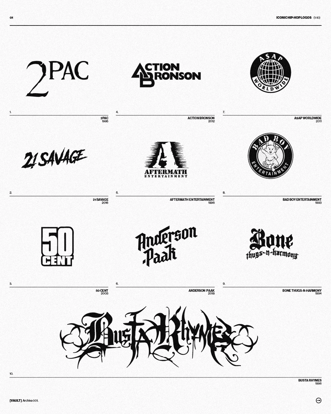
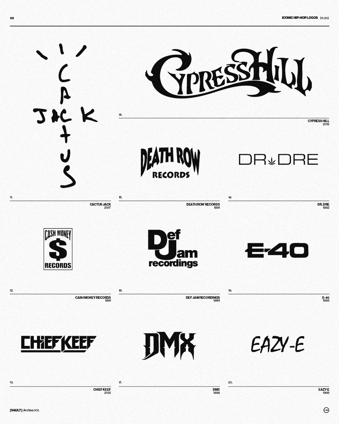
In the pre-algorithm era, record labels were the ultimate curators. The logo was a "filter.” When you spotted the scowling baby of Bad Boy Records or the electric chair of Death Row Records, you didn't need to hear the bass to know exactly the attitude and the danger involved. When Rick Rubin and Russell Simmons launched Def Jam Recordings, they created a visual anchor so heavy that even forty years later, that stacked "DJ" still carries the grit of 1980s New York.
This is where the narrative of power begins. Jay-Z didn't just climb the corporate ladder at Def Jam; he used his own visual identity to signal a transition from the street corner to the boardroom. For Hov, the mark was the message: rap was no longer a guest in the house of business—it owned the deed.
The Myth and the Mask
Then there are the logos that function as modern-day folklore. The Wu-Tang "W" is the most successful piece of subversive branding in history. It’s a jagged, aggressive mark that feels like it was carved into the culture with a blade. To recognize that "W" is to acknowledge a movement.
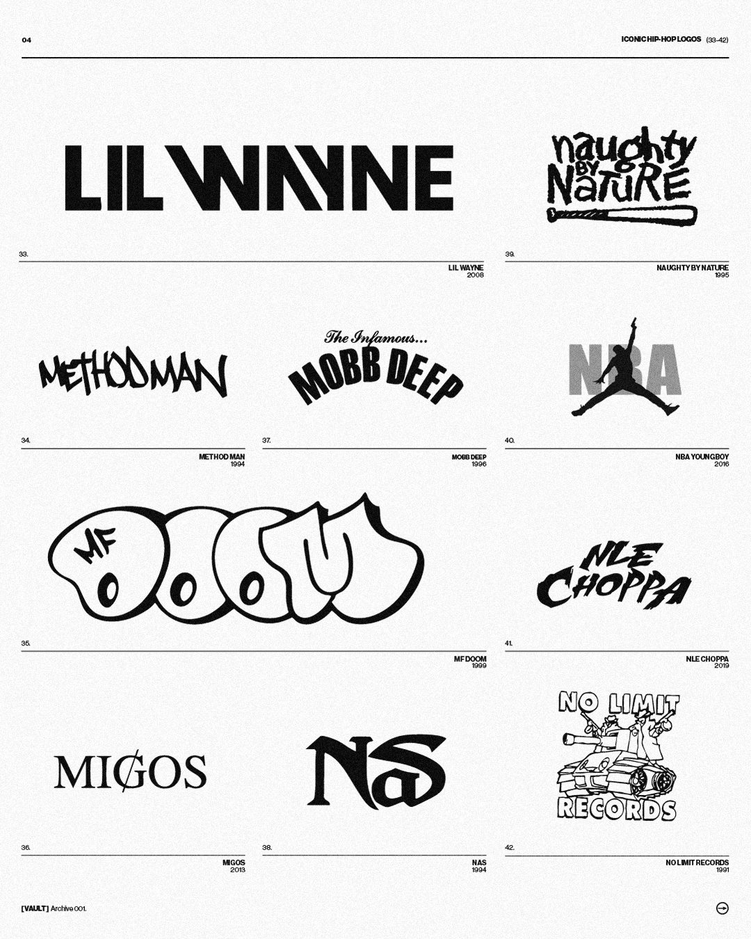
This understanding of "the symbol as the artist" reached its peak with the late MF DOOM. By turning his identity into a literal metal mask, DOOM transcended the need for a face. The mask became the logo. It allowed him to be everywhere and nowhere at once, proving that in this scene, recognition isn't about being seen—it's about being understood. It’s the ultimate "if you know, you know."
Ecosystems of Recognition
For the generation that grew up on Tumblr and Pinterest, the logo has evolved into something more fluid. It’s no longer just a stamp on a record sleeve; it’s a "vibe check" that bridges disparate worlds.
Take Cactus Jack. Travis Scott didn't just design a logo; he engineered a distorted, hand-drawn visual language that feels like a hallucination. When that logo hits a Nike collaboration, it’s a seismic shift. It’s no longer the brand endorsing the artist; it’s the artist’s visual seal of approval making the corporate giant feel "real" again.
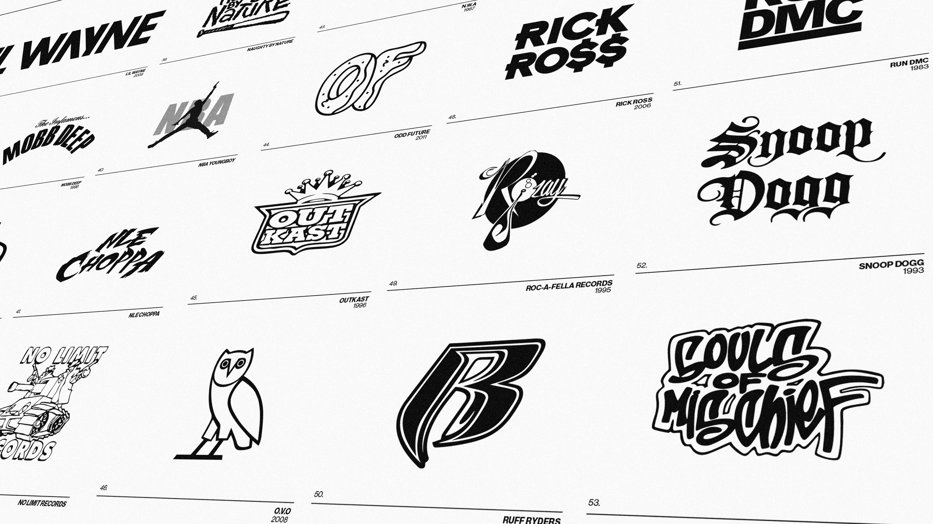
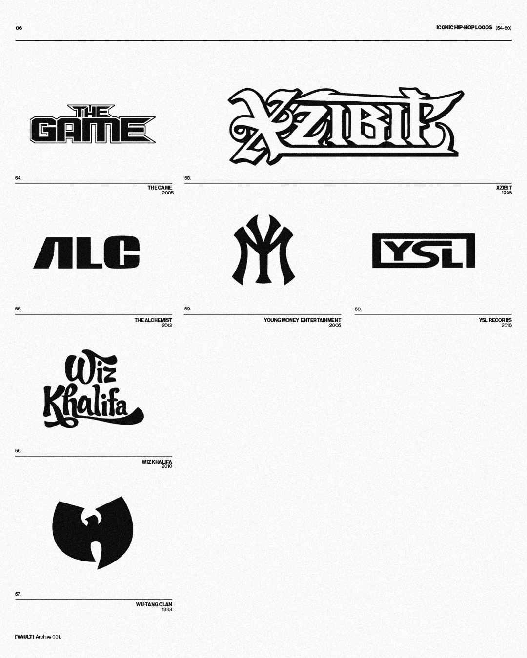
This same thread of recognition runs through the minimalist owl of OVO and the thin, sharp lines of YSL. These marks don't need to shout. They function as silent handshakes for those who know. Whether it’s the colorful irreverence of Odd Future or the raw, unfiltered energy of A$AP Mob, these logos are the gatekeepers. To recognize them is to be part of the narrative.
The Final Cut
Rappers are, and have always been, the most intuitive Creative Directors on the planet. They understand that a great logo doesn't just represent a person; it represents an era, a struggle, and a victory.
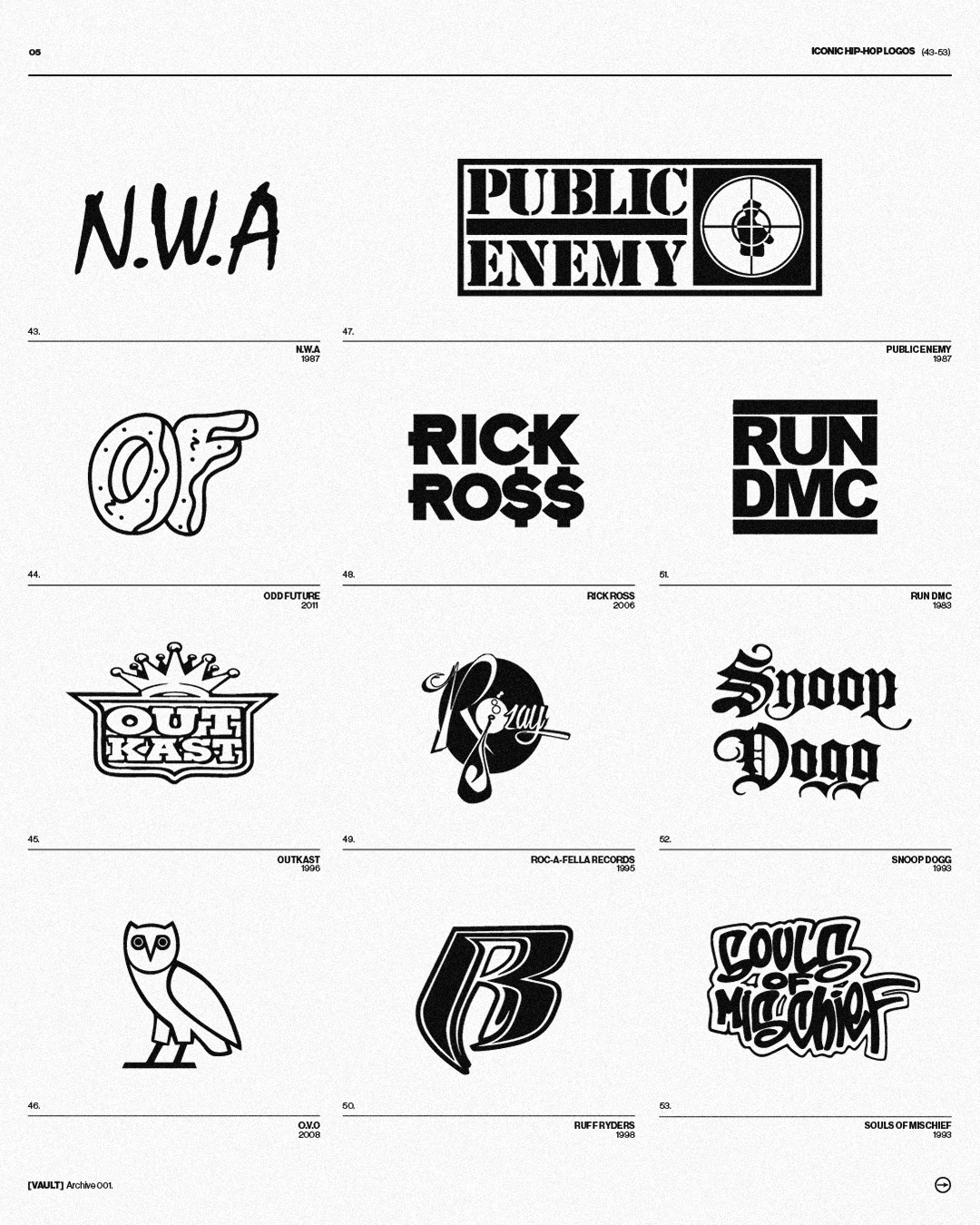
From the luxury posturing of Chief Keef’s iconography and the ostentatious "R" of Rick Ross to the polished dominance of the major labels, these 60 marks are the scars and trophies of a culture that refused to be ignored. These are the rap logos that turned a genre into a global heritage.
Flip through Taschen’s Logo Modernism and you’ll find logos that breathe order and corporate stability. But there is another history of design being written in the margins, one that doesn’t follow the rules of a Swiss studio. It’s a history written in the basement of a NYU dorm with Def Jam, in the calculated chaos of Odd Future, and in the psychedelic distortion of Cactus Jack.
This collection isn't just a "best of" list for the sake of nostalgia. It’s a study of how these rap logos from the history of hip-hop acted as cultural co-signs, building a unique visual alphabet. While the design world was busy worshipping the Helvetica of the 60s, rap was busy creating symbols that could stop a heart and start a huge movement.
The Foundation
In the pre-algorithm era, record labels were the ultimate curators. The logo was a "filter.” When you spotted the scowling baby of Bad Boy Records or the electric chair of Death Row Records, you didn't need to hear the bass to know exactly the attitude and the danger involved. When Rick Rubin and Russell Simmons launched Def Jam Recordings, they created a visual anchor so heavy that even forty years later, that stacked "DJ" still carries the grit of 1980s New York.
This is where the narrative of power begins. Jay-Z didn't just climb the corporate ladder at Def Jam; he used his own visual identity to signal a transition from the street corner to the boardroom. For Hov, the mark was the message: rap was no longer a guest in the house of business—it owned the deed.
The Myth and the Mask
Then there are the logos that function as modern-day folklore. The Wu-Tang "W" is the most successful piece of subversive branding in history. It’s a jagged, aggressive mark that feels like it was carved into the culture with a blade. To recognize that "W" is to acknowledge a movement.
This understanding of "the symbol as the artist" reached its peak with the late MF DOOM. By turning his identity into a literal metal mask, DOOM transcended the need for a face. The mask became the logo. It allowed him to be everywhere and nowhere at once, proving that in this scene, recognition isn't about being seen—it's about being understood. It’s the ultimate "if you know, you know."
Ecosystems of Recognition
For the generation that grew up on Tumblr and Pinterest, the logo has evolved into something more fluid. It’s no longer just a stamp on a record sleeve; it’s a "vibe check" that bridges disparate worlds.
Take Cactus Jack. Travis Scott didn't just design a logo; he engineered a distorted, hand-drawn visual language that feels like a hallucination. When that logo hits a Nike collaboration, it’s a seismic shift. It’s no longer the brand endorsing the artist; it’s the artist’s visual seal of approval making the corporate giant feel "real" again.
This same thread of recognition runs through the minimalist owl of OVO and the thin, sharp lines of YSL. These marks don't need to shout. They function as silent handshakes for those who know. Whether it’s the colorful irreverence of Odd Future or the raw, unfiltered energy of A$AP Mob, these logos are the gatekeepers. To recognize them is to be part of the narrative.
The Final Cut
Rappers are, and have always been, the most intuitive Creative Directors on the planet. They understand that a great logo doesn't just represent a person; it represents an era, a struggle, and a victory.
From the luxury posturing of Chief Keef’s iconography and the ostentatious "R" of Rick Ross to the polished dominance of the major labels, these 60 marks are the scars and trophies of a culture that refused to be ignored. These are the rap logos that turned a genre into a global heritage.
SHARE
Latest articles


