Imagine walking through a city like New York or London and trying to spend just five minutes without looking at a single letter. It is almost impossible. Now, imagine trying to do that without seeing one specific set of shapes: Helvetica. Gary Hustwit’s 2007 documentary begins with this very realization. It is not just a film about a font; it is a story about how we perceive the world and how a group of Swiss designers in 1957 accidentally created the visual language of modern capitalism.
Bryant Park, NYC by Angeline Wagner
The story starts in the post-war era. The world was messy, recovering from chaos, and the design world was cluttered with flowery, decorative scripts that felt outdated. Enter Max Miedinger and Eduard Hoffmann. They wanted to create something neutral, something that looked like it had no attitude at all. They called it Neue Haas Grotesk, later renamed Helvetica to sound more international and Swiss. The documentary shows how this font became a tool for order. It was the clean slate the world was looking for.
One of the most striking parts of the film is how it presents a clash of philosophies. On one side, you have the legendary Massimo Vignelli. He speaks about Helvetica with a religious fervor, describing it as a cure for a visual disease. To him, design is about logic and clarity. He famously used it for the New York City Subway map, believing that the font was so perfect it didn't need to express emotion—it just needed to work. Watching him explain why a B or an R is beautiful feels like listening to a master tailor describe the perfect stitch.
But then, the story takes a turn. As Helvetica became the default choice for every major corporation—from American Airlines to Toyota—it started to feel like the voice of the establishment. The documentary highlights the rebellion of the 1970s and 80s. Designers like Stefan Sagmeister and David Carson began to push back. They argued that we should not confuse legibility with communication. They felt that Helvetica had become a symbol of a boring, sanitized world. This part of the film is a fascinating look at the punk rock era of graphic design, where being messy was a political statement against the perfect Swiss lines.
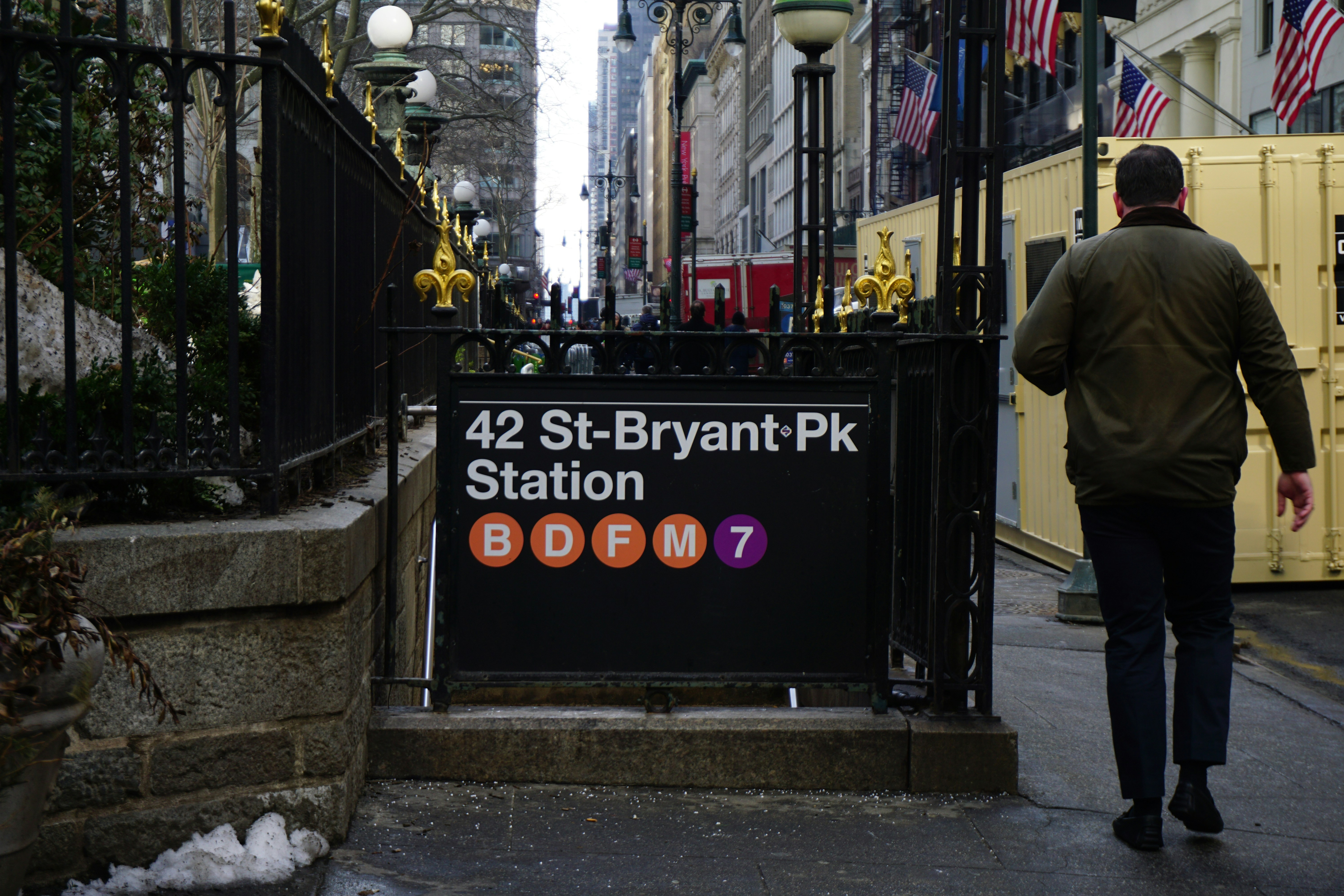
One of the best moments in the documentary is a sequence where the camera simply pans across a street. As you watch, you realize that Helvetica is everywhere: on your taxes, your medicine bottles, your favorite stores, and the signs telling you where to go. It is the invisible air of the modern world.
By the end, the documentary leaves you with a profound sense of how much thought goes into things we usually ignore. Whether you love it for its clarity or hate it for its ubiquity, the film proves that Helvetica is more than just a font. It is the horizontal and vertical grid upon which our modern culture is built. It reflects our desire for transparency, our need for authority, and our occasional urge to tear it all down and start over.


